Role: Solo UX Researcher and UX Designer
Tools: Wireframing, Figma, Prototyping
Timeline: 4 weeks
Goal: Help gallery visitors easily find and explore information about artists and artworks.
Problem
Visitors to art galleries often struggle to find clear, contextual information about artists and artworks. Existing tools can feel overwhelming or hard to navigate, and in-gallery signage is not accessible after they end their visit.
Challenge: Design an app that presents information intuitively, clearly, and engagingly, enhancing the visitor experience.
Research & Insights
Methods: Competitive analysis of museum/gallery apps, User interviews, Observation of user flows and pain points
Key Insights: Users want quick, digestible info about artworks and artists. Clear visual hierarchy improves comprehension. Research showed the desire to know methodology, not simply artist bio information. The possibilities for future app expansion include: interactive features for users, such as favorites and a map feature for users to find other galleries in the area.
Design Process
Ideation & Sketching
I explored layout options with low-fidelity sketches, focusing on organizing and simplifying content for intuitive navigation. Working alone, I admittedly do not have much outward examples of changes from sketch to wireframe, as a lot of it happened in my head as I went. Working with a team will be much different, and I am excellent at communicating with others in that setting.
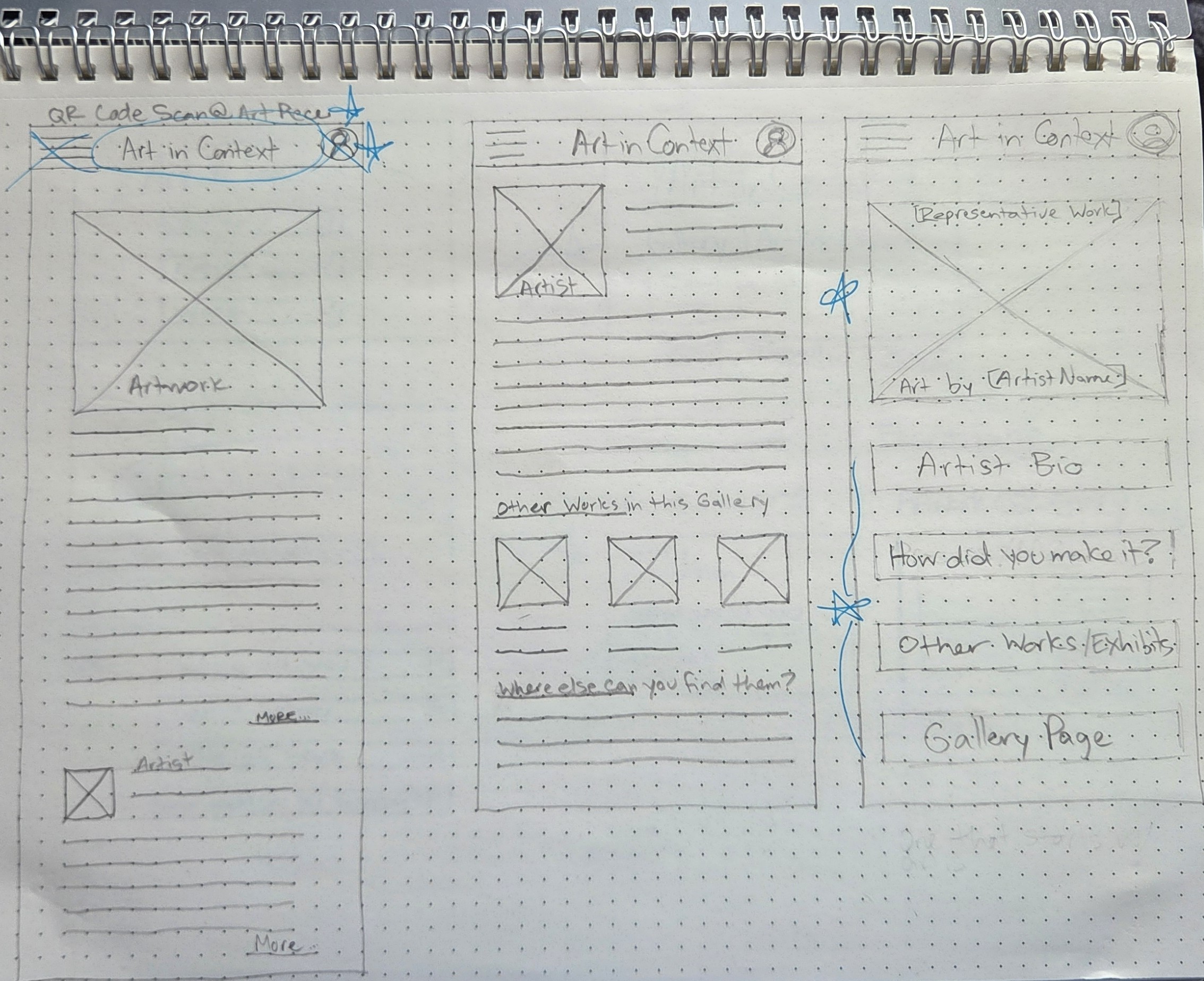
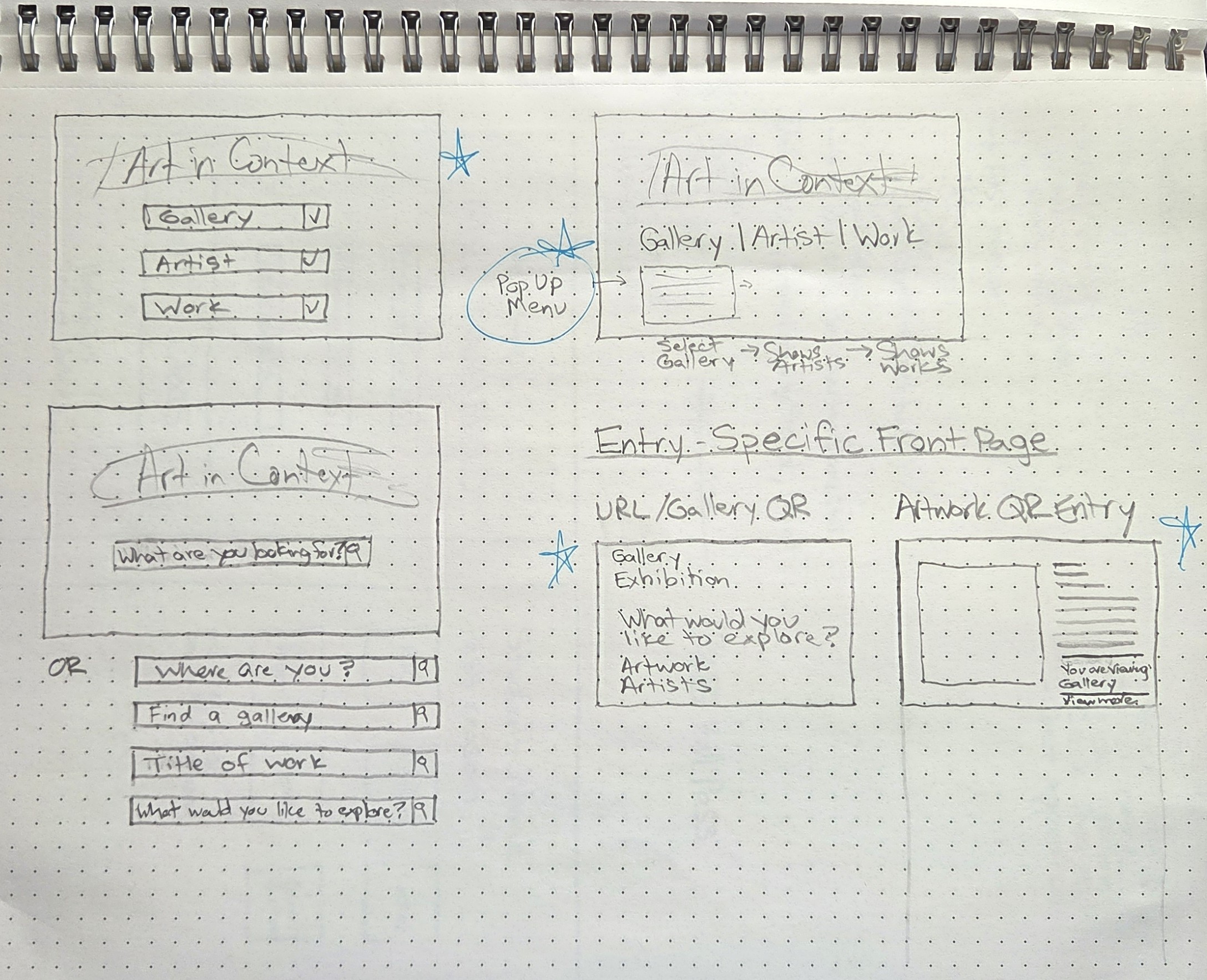
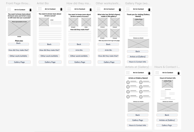
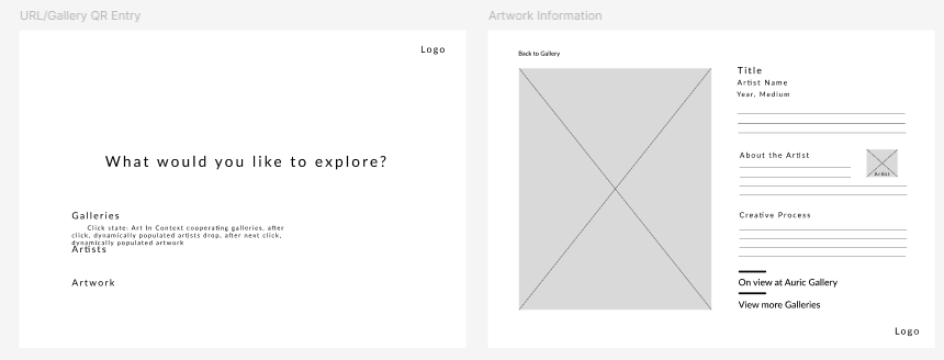
Wireframes
I used wireframes on Figma to test hierarchy and user flow. I iterated on navigation placement and content grouping. I have mixed feelings about this step, but not in a bad way. Being such a visual person (internally and externally), wireframes seem to me to be very plain and easy to understand, but also incredibly open-to-interpretation. I enjoy to ease they allow in re-arranging and iterating ideas quickly.
High Fidelity Mockups
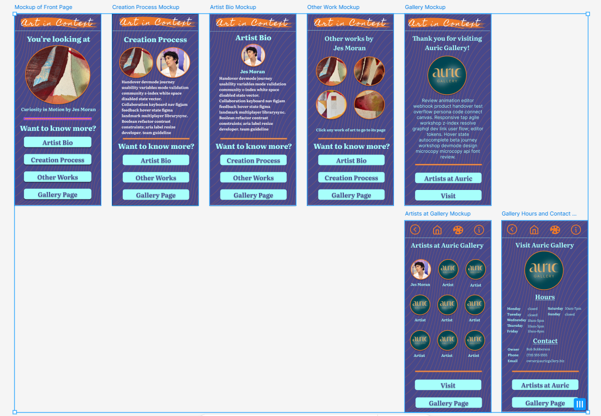
This is where I enjoy myself the most. I take pride in making things look really good and work really well. The creativity of this step often inspires more ideas, whether small tweaks for aesthetics or even a change to a completely different project! For "Art in Context", I began designing the app first. I created a color scheme and a simple logo before I applied color and typography to the layouts. I ensured accessability throughout, and checked consistency and clarity across different types of screens. I refined the layout based on usability feedback.
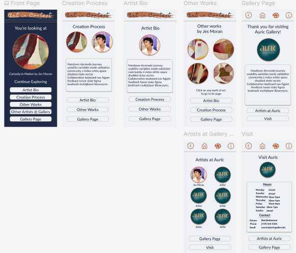
My goal was to let the artwork be the star, and to let everything else look sophisticated and clean. I also wanted the app and website to be unique experiences while still being recognizable as a brand. Since they were being used in unique circumstances - the app would be used in gallery, while the website would likely be used at home as an extention of the visit - I wanted to give them their own feel.
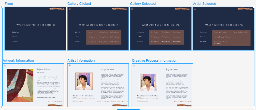
My first iteration had a brighter version of the color palette and more of a playful background.
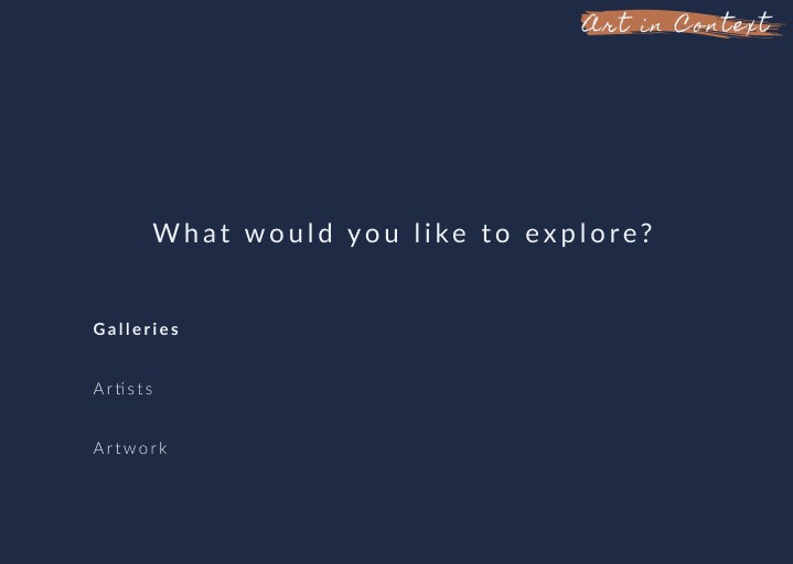
After some reflection, I felt that I needed to tone it down toward the understated. I tweaked the color scheme toward deeper and richer tones and cleaned up the background. I decided to make the "landing page" (accessed through a QR code in gallery next to the artwork the user is viewing) very distinct, thus the darker background. I later decided to use this darker version for the entry page of the website as well, for continuity and familiarity.
Outcome
The final interactive prototypes allow users to access artwork information (including artistic process and biographical information), increasing visitor engagement with the artwork. "Art in Context" allows users to navigate to other works in the gallery by that artist, also increasing engagement with the artist's larger body of work. The visitor can access information about the gallery, as well. While I first sought to connect the in-gallery visitor more with the art they were looking at, I expanded the idea to encompass a responsive website side of the experience as well. Doing this, I expanded the usability and points of contact with a wider variety of users.
Reflection
Key takeaways:
- As this was my first UX design project, I really enjoyed strengthening my end-to-end UX skills: research to wireframing to high fidelity prototypes.
- I used my background knowledge of the Principles of Design to help create an aesthetically pleasing design and an intuitive layout.
- I built my confidence through my ownership of this solo project, while translating my course learning into portfolio-ready work.