Overview
Role: Solo UX Researcher and Designer (End to End: Research planning, Competitive analysis, User interviews, Persona creation, User journeys, Wireframing, Prototyping, Usability testing, Visual design)
Tools: Figma
Timeline: Initial concept and prototype completed in 4 weeks. Following additional self-directed study, I returned to refine the interface, workflow, and interaction design.
Goal: Design a mobile-first hall pass documentation app to help teachers (K-12) quickly track student movement during class, reduce interruptions, and improve accountability across grade levels.
Problem
Teachers need a fast, accurate, low-disruption way to document student hall passes because existing systems are slow, inconsistent, or paper-based, causing lost instructional time and incomplete records.
Challenge: Design an app that can be used easily and quickly in a realistic classroom scenario.
Research & Insights
User Research
Research Goal:
To understand how middle school educators manage student movement, identify breakdowns in accountability and efficiency, and determine whether a digital hall pass system could improve classroom flow without increasing teacher workload.
Method and Participants:
A survey was created and sent to 9 middle school educators who serve grades 6-8 in different capacities: 3 6th grade, 1 7th grade, 2 8th grade, and 3 educators that served across multiple grades: Art, Library, and TAG (Talented and Gifted).
In their survey responses, participants discussed their current hall pass workflows, satisfaction with existing systems, accountability challenges, device usage, comfort with digital classroom tools, and concerns about adopting a digital solution.
Key Insights: Research revealed that in order for an app to make sense to replace the various current procedures, it had to work with current technology available to the teachers, it must be fast and easy, and it must add to the feeling of accountability within the school and classroom.
A User Persona
Sarah, 43 (A composite persona of multiple teachers interviewed)
Experience: 14 years teaching middle school
Technology Comfort: High
Devices: District-issued laptop, personal Smartphone nearby during instruction
Goals:
Student safety, keep instruction moving with minimal interruptions, maintain accountability while allowing students to leave when necessary.
Frustrations:
Safety/security risks of paper passes, ability to track and verify where students are (in normal circumstances and emergencies), interruption of instruction. Quote, "I don't want to stop class every time a student needs to use the restroom."
User Journey
Before App
Student raises hand during class to request a hall pass, often interrupting instruction or otherwise important tasks. Teacher calls them to their desk, asks necessary questions, writes pass. Teacher then documents the pass on paper or some other way. Teacher re-starts instruction. If this is all that is needed, It interrupts class for roughly 3 minutes. The teacher will then also need to monitor the time that the student is absent, adding to the teacher's mental load.
If the student is gone too long, the teacher will then need to call for assistance in locating the student for safety purposes. During all of this time, there is no way for the teacher or anyone else to know whether the student is in the designated area or not, causing safety concerns.
In a different - but common - scenario, a teacher will need to verify that the destination for the pass is valid by calling either a teacher, an office, or security, as sometimes there are students who are limited in their pass allowances. This interrupts instruction or other important activity elsewhere in the school as well. This typically takes at least another 3 minutes of the original teacher's class time.
With App
Student indicates the need for a hall pass. The student can come up and apply for the hall pass themselves, filling in the appropriate information. Once the teacher approves it (which takes seconds with a password), that information is then sent or is available to the relevant adults outside of the classroom to then be able to monitor the student. The teacher does not need to watch the clock because the app will let the teacher know if the student has been gone too long, and will also automatically be given the one-touch option to alert the appropriate adults outside of the classroom that the student needs to be found and attended to. This takes minimal interuption to activity within the classroom and teacher mental load, leaving the legwork and the worry to the adults outside of the classroom who are designated for just such jobs (security, office, administration, etc.).
Key findings & their influence on the design
Finding #1
Despite the obviously time-consuming nature of written hall passes, six of the eight educators described accountability—not the writing out itself—as their biggest challenge. Common concerns included: students remaining out of class for too long, no real-time visibility of student location, and uncertainty during emergency situations (including simulated drills).
Influence:
This insight led me to make sure that the app had automated school-wide notification features.
Finding #2
Speed and ease-of-use are essential. If it is not intuitive to use or doesn't reduce instructional interruptions, then it is not of use.
Influence:
The design was intentionally kept to as few clicks-per-interaction as possible.
Finding #3
A hall pass system should be school-wide in order to be effective for accountability and safety. It cannot stop at the classroom door.
Influence:
Features were added to make this app connective and easy-to-use, such as automatic notifications to relevant adults, time estimates for passes, automatic alerts, and other customizable communication features that connect Faculty in a user-centric and frictionless way.
Design Process
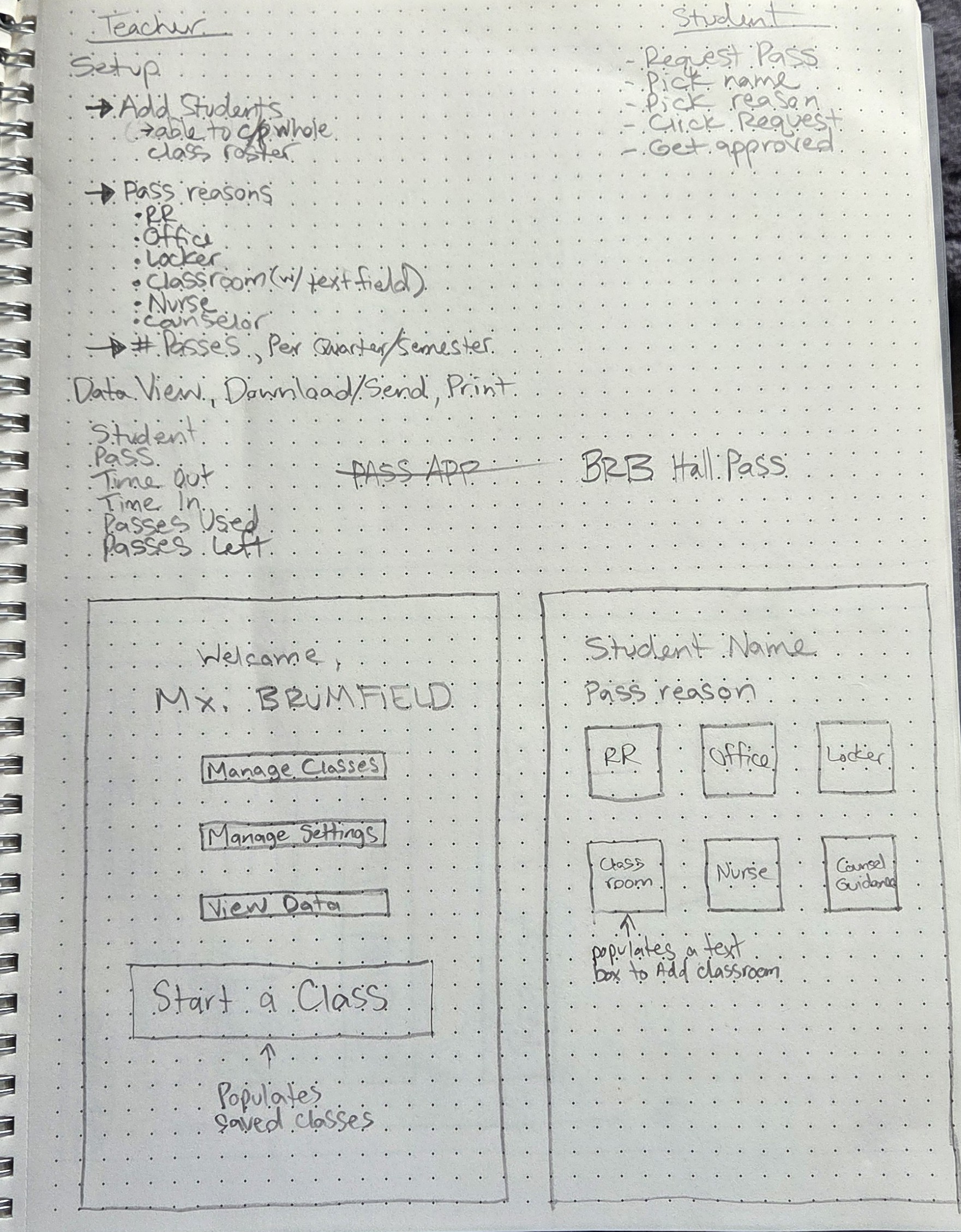
Ideation & Sketching
Layout options were explored using sketches. The focus was on organizing and simplifying content for intuitive navigation.
App Sketches and Notes
Wireframes
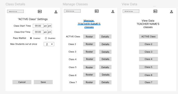
Wireframes on Figma were used to test hierarchy and user flow. Navigation placement and content grouping are simple to rearrange in this step for optimization. It also allowed me to more accurately assess what could be better streamlined.
Usability Testing
5 participants completed task-based usability testing using a high-fidelity prototype that simulated the core user flows. Prototype limitations were explained before testing so participants could focus on evaluating the experience rather than prototype completeness.
As the sole designer on this project, I viewed usability testing as more than a validation step—it was an opportunity to invite fresh perspectives into the design process. Participants consistently identified opportunities I hadn't considered, and incorporating their feedback strengthened the final experience. That experience reinforced how much I value collaboration and constructive critique, and it's one of the aspects of working on a cross-functional product team that I'm most excited about.
Outcome: 5 participants successfully completed all core tasks, while revealing several friction points that led to improvements in navigation and button labeling.
High Fidelity Mockups
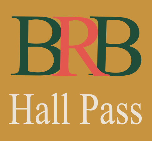
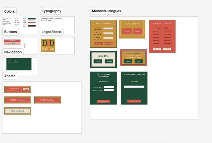
The design for this app needed to be clean and easy to see and navigate. I chose a warm, high-contrast color palette inspired by familiar classroom materials. The lighter interface allows status changes, modals, and alerts to stand out when they appear.
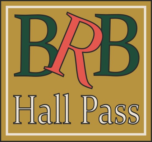
The above original logo felt too playful for a product intended for educators across multiple grade levels. Through iteration, I refined the layout and updated the color palette to create a cleaner and more versatile visual identity.
Main Layout
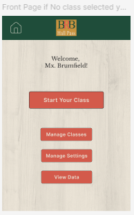
Once the color scheme was decided on, the next goal was to make sure that it was used to its full advantage. The main layout was left fairly light purposefully so that modals and toasts would stand out when they popped up. A subtle wood grain was added to the background for the nostalgic schoolhouse feel.
Design System
I created a design system, knowing that it would help to make this app expandable and scaleable. There are many more features that could be designed for in the future, and I wanted the product to be very cohesive, no matter how large it got.
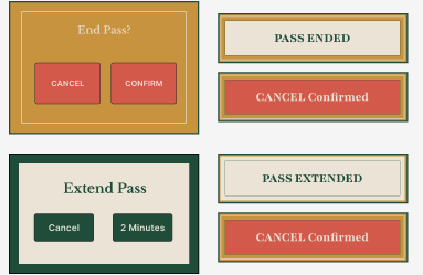
Some Toasts and Modals close up
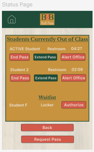
Main Status Page
This is the main page that will show the status of passes. It generates an easy at-a-glance overview of who is out, where, and how long, as well as allowing the teacher to execute certain actions directly from the status page in as little time as possible.
High Resolution Mockups
Though this app is much more complex in its curent state than my previous project, the uniformity and simplicity of the design makes for a low amount of mental load to complete a task.
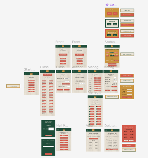
Prototype and Workflow Page
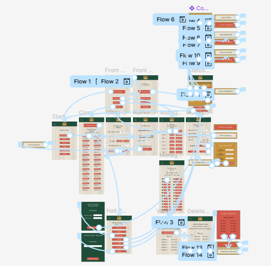
Prototype Example
Outcome
Understanding what was needed to create a usable product was not the difficult part because of my experience as an educator. The research and testing easily filled in any gaps of what was needed to make it more universal (beyond my personal experience). The increased scope of this project challenged me to continuously build my technical skills in Figma. I sought out and applied new design and prototyping techniques as new interaction patterns and interface requirements emerged.
Reflection
Key takeaways:
1. Creating something that is simple to start but can expand easily later requires foresight. Throughout this project, I had to make intentional decisions about scope. In the end, it wasn't about building my ideal app—it was about creating a solution that fit naturally into teachers' existing routines. Broader administrative features could be added later, once the teacher's primary workflow was optimized.
2. Learning to build reusable components and design patterns in Figma transformed the way I approached interface design. It improved the efficiency of my workflow while creating a more scalable and consistent user experience.
3. This project reinforced how iterative UX design truly is. I created much of the application while teaching full time, then returned to it after the school year with fresh perspective. I revisited nearly every aspect of the design—not because it was wrong, but because I knew it could be better. Along the way, I continually sought out new techniques and Figma capabilities to create more effective interactions, even when it meant learning something completely new.

.jpg)